


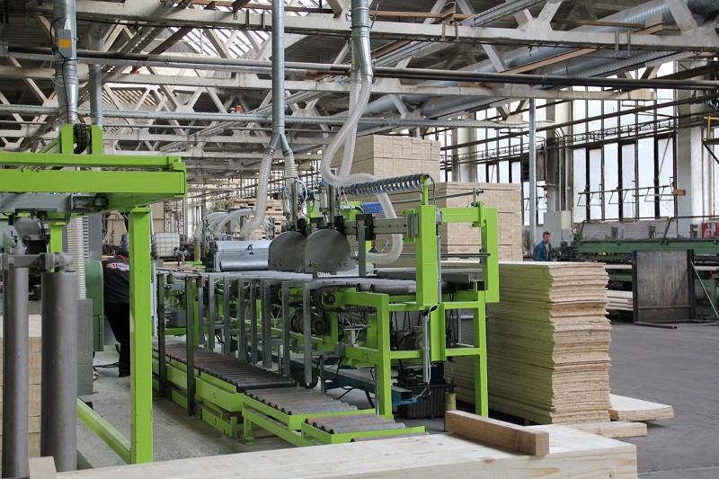


Šalovacie dielce -SD1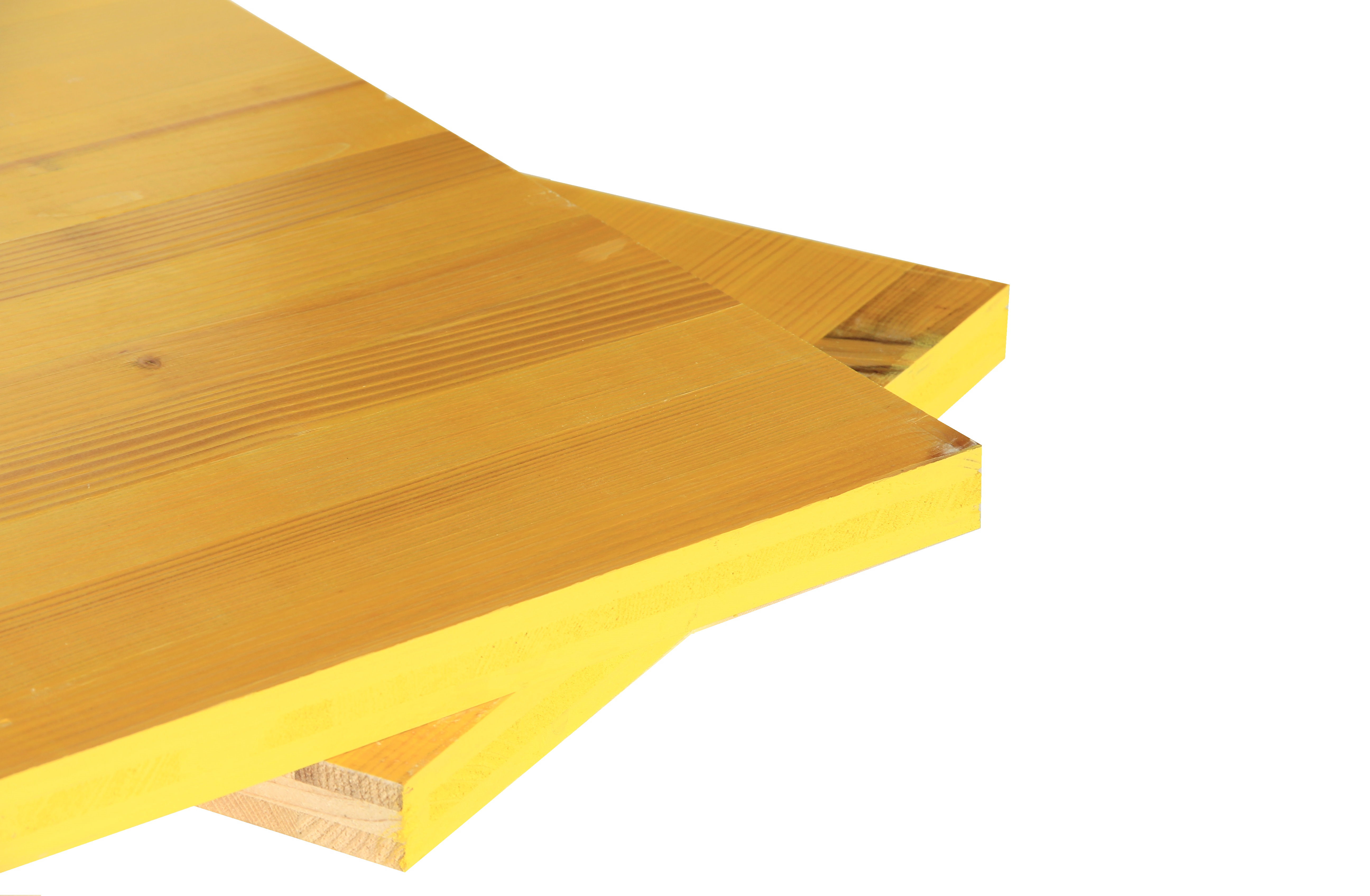
| Rozmery: | Dĺžka |
štandardná:
|
1000/1500/2000/2500/3000 mm
|
| Šírka |
štandardná: neštandardná: |
500 mm 2000/1000/450/400/350/300/250 mm |
|
| Hrúbka |
21 mm 27 mm |
||
| Váha |
21 mm ca. 10,0 kg/m2 27 mm ca. 12,5 kg/m2 |
Šalovacie dielce sa vyznačujú nasledovnými vlastnosťami:
 |
| Technický list SD1 |
- minimálna deformácia
- vysoká pevnosť v ohybe
- široká oblasť použitia
- hrúbka 21 a 27 mm, dĺžka 1-3 m
- trojvrstvová konštrukcia
- vodeodolné zlepenie podľa DIN Standard (AW 100)
Braga Spa
Bragapan
Slovincom
 Braga Spa
Included with this the template is our J51 Carousel module. This easy to use, highly versatile and fully responsive module allows you to place any content within an attractive carousel, an excellent solution to showcase your work in a small space. It's many uses include displaying a portfolio of work right across to a simple testimonials module. The possibilities are endless!
The module includes an editor field for each column of your carousel so any content you can add to a standard article editor you can also add to your carousel. You can then set the number of columns you wish visible with each slide from one up to six. Other option fields include, navigation, pagination, transition style, transition delay and transition interval. There is also responsive options to set the number of columns per slide across various screen sizes.
A utility class is a class that defines a set of methods that perform common, often re-used functions. Your template includes a number of helpful utility classes to help style your content. In Joomla there is a number of different methods of adding a class name to an element..
Inline Styling
The most basic method is inline directly in to the HTML of your document. Note that this method is only used when your are viewing the HTML source of your document either via the CodeMirror editor or the source/HTML option available in most other editors. An example would look something like the following....
<h2 class="padding-bottom-40">
    A Sample Heading
</h2>
The above class name of padding-bottom-40 will add a padding (space) of 40px to the bottom of the text.
Module Class Suffix (Module)
This method is specific to modules. If you click in to the settings of any module and select the 'Advanced' tab you will notice a 'Module Class Suffix' field. Simply add the utility class to apply the CSS of this class to the enitre module. An popular example would be the utility class 'text-light' which will convert all the text within a module to white which you will find useful if you have a dark background image or color set for the module area background. Note you can add as many classes as you like by simply separating them with a space.

Link CSS Style (Menu Items)
This final method is specific to menu items. Clicking in to the settings of any menu item (Menus -> [YourMenu] -> [YourMenuItem]) and selecting the 'Link Type' you will notice a 'Link CSS Style' field. This will allow you to apply a class to that particular menu item.
Text/Icons Color Classes
| Class | CSS Property |
|---|---|
| text-light | All containing text/icons is light |
| text-dark | All containing text/icons is dark |
Padding & Margin Classes
| Class | CSS Property |
|---|---|
| padding-top-0 | padding-top: 0px; |
| padding-top-5 | padding-top: 5px; |
| padding-top-10 | padding-top: 10px; |
| padding-top-15 | padding-top: 15px; |
| padding-top-20 | padding-top: 20px; |
| padding-top-30 | padding-top: 30px; |
| padding-top-40 | padding-top: 40px; |
| padding-top-60 | padding-top: 60px; |
| padding-bottom-0 | padding-bottom: 0px; |
| padding-bottom-5 | padding-bottom: 5px; |
| padding-bottom-10 | padding-bottom: 10px; |
| padding-bottom-15 | padding-bottom: 15px; |
| padding-bottom-20 | padding-bottom: 20px; |
| padding-bottom-30 | padding-bottom: 30px; |
| padding-bottom-40 | padding-bottom: 40px; |
| padding-bottom-60 | padding-bottom: 60px; |
| padding-horiz-10 | padding: 0 10px; |
| padding-horiz-20 | padding: 0 20px; |
| padding-horiz-30 | padding: 0 30px; |
| padding-horiz-40 | padding: 0 40px; |
| padding-horiz-60 | padding: 0 60px; |
| padding-vert-10 | padding: 10px 0; |
| padding-vert-20 | padding: 20px 0; |
| padding-vert-30 | padding: 30px 0; |
| padding-vert-40 | padding: 40px 0; |
| padding-vert-60 | padding: 60px 0; |
| Class | CSS Property |
|---|---|
| margin-top-0 | margin-top: 0; |
| margin-top-5 | margin-top: 5; |
| margin-top-10 | margin-top: 10; |
| margin-top-15 | margin-top: 15; |
| margin-top-20 | margin-top: 20; |
| margin-top-30 | margin-top: 30; |
| margin-top-40 | margin-top: 40; |
| margin-top-60 | margin-top: 60; |
| margin-bottom-0 | margin-bottom: 0; |
| margin-bottom-5 | margin-bottom: 5; |
| margin-bottom-10 | margin-bottom: 10; |
| margin-bottom-15 | margin-bottom: 15; |
| margin-bottom-20 | margin-bottom: 20; |
| margin-bottom-30 | margin-bottom: 30; |
| margin-bottom-40 | margin-bottom: 40; |
| margin-bottom-60 | margin-bottom: 60; |
| margin-horiz-10 | margin: 0 10px; |
| margin-horiz-20 | margin: 0 20px; |
| margin-horiz-30 | margin: 0 30px; |
| margin-horiz-40 | margin: 0 40px; |
| margin-horiz-60 | margin: 0 60px; |
| margin-vert-10 | margin: 10px 0; |
| margin-vert-20 | margin: 20px 0; |
| margin-vert-30 | margin: 30px 0; |
| margin-vert-40 | margin: 40px 0; |
| margin-vert-60 | margin: 60px 0; |
Background Color Classes
| Class | CSS Property | Color |
|---|---|---|
| background-white | color: #FFFFFF; | |
| background-black | color: #000000; | |
| background-gray | color: #888888; |
| Class | CSS Property | Color |
|---|---|---|
| background-gray-dark | color: #333333; | |
| background-gray-light | color: #cccccc; | |
| background-gray-lighter | color: #ebebeb; |
It is worth noting that we have not used !important with any of these classes, therefore if you apply a utility class to an element that has !important CSS styling applied to it then this styling will not be overridden.
If you like this feature please let us know in our forums and we will extend on this in future template releases!


